Best Practice

UX Accessibility

Designing for All

Accessible design plays a vital role and is a shared responsibility in today’s digital world, which should provide inclusive access for everyone. The UX Accessibility Best Practices outline key steps that anyone, whether faculty, staff, or students, can follow to ensure their content, materials, or digital structures support an accessible user experience.

The online learning UX project was a capstone course involving the National Disability Center for Student Success and iSchool students at UT Austin. Then Graduate students Sophia and Kelly led the project, and together, they conducted usability testing to evaluate the accessibility and user experience of a digital course. Their findings informed specific improvements to course design, timing clarity, navigation, and assistive technology support.

Why It Matters

Accessibility is not just a technical requirement; it reflects our shared values of inclusion and equity, ensuring that people with disabilities have access to the same content as everyone else.

Faculty

Designing slides, LMS content, and course materials with accessibility in mind ensures that all students can engage equally.

Students

Applying accessibility principles equips students with essential academic and professional skills.

Staff

From updating departmental websites to sharing announcements, staff ensure digital content works for everyone.

Accessibility isn’t a niche concern—it’s foundational to equitable learning environments.

WCAG (Web Content Accessibility Guidelines) is a globally recognized set of standards built on four principles: Perceivable, Operable, Understandable, and Robust (POUR).

Tips for Designing Accessible Websites

Ensure Sufficient Color Contrast

Text and background must have high enough contrast for users with low vision or color blindness. This supports users with low vision and color blindness and ensures readability across devices and lighting conditions.

Avoid Relying on Color Alone

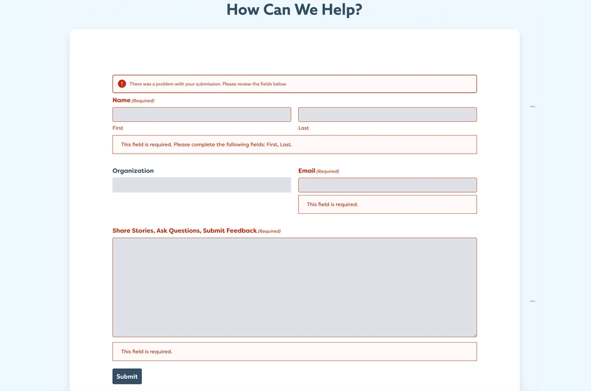
Combine color with text, icons, or patterns to communicate meaning. For example, use a red border and a “Please enter a valid email” message in forms, pair labels with textures in charts, use icons and color together for status indicators such as ✔ Active or ✖ Inactive, and provide legends with text or icons in calendars.

Make All Functions Keyboard Accessible

Interactive elements like buttons, menus, and form inputs should be operable via keyboard. This is essential to support people with motor disabilities and those using assistive technology.

Use Clear and Consistent Labels

Descriptive labels help users navigate more easily, especially those using screen readers, people with cognitive disabilities, and those who skim quickly. Labels should be meaningful out of context and avoid vague phrases like “Click here.” All form fields and icons should be clearly labeled.

Provide Text Alternatives for Images

Alt text makes images accessible to non-visual users. For example, use descriptive alt text like: “Smiling, college student working on a laptop at a desk.” This ensures that screen readers convey the content and purpose of the image.

Design with Mobile and Zoom Users in Mind

Accessible content should display well on all screen sizes and at various zoom levels. This helps users with low vision who zoom in and ensures usability across mobile devices.

Support Screen Readers and Assistive Technology

People with disabilities often rely on tools like screen readers (VoiceOver, TalkBack), toggle toolbars for font size and contrast, keyboard navigation, or voice control. Testing should include turning on screen readers and checking toggle features to ensure usability and task completion without a mouse.


Make PDFs and Videos Accessible

Documents and media must be usable for everyone. PDFs should have selectable text and properly styled headings. Videos must include accurate, synced captions and transcripts to support screen reader users, deaf or hard-of-hearing users, and those with cognitive or motor disabilities.


Quick Self Check

How accessible is your website?

High Contrast

  1. Can you read text in grayscale or bright light?
  2. Is important information conveyed using color alone?
  3. Does the text remain readable on light and dark backgrounds?

The “Toggle High Contrast” feature lets users quickly adjust screen colors for improved readability.

Keyboard & Screen Reader Accessibility

  1. Can you use menus and complete forms without a mouse?
  2. Is there a clear focus indicator?
  3. Is the site compatible with screen readers?
  • Test your web forms: Use Tab to move forward, Shift + Tab to go back, Enter/Space to activate
  • Use a screen reader: VoiceOver (Mac), NVDA (Windows), or TalkBack (Android)
  • Navigate your website with only your keyboard: Try navigating your website using Tab and/or Enter

Example of the National Disability Center website’s assistive toolbar, which allows users to toggle high contrast mode and increase font size, essential features for users with low vision or reading difficulties.

Accessible Design & Clear Call-To-Actions

  1. Would the message still be clear in black and white?
  2. Is color use always paired with another indicator?
  3. Do labels make sense out of context?
  4. Are vague labels like “Click Here’ avoided?
  5. Are form fields and icons clearly labeled?
  • Test your web forms: Try submitting a form with errors, are the error messages clearly communicated with text, color and icons?
  • Scan your site: Replace all vague labels like ‘Click Here’ with something more descriptive like ‘Read Full Article.’

Example of the center’s website using both color and text to indicate missing input in the required fields

Accessible PDFs & Videos

  1. For PDFs: Is the text selectable? Are headings styled properly?
  2. For videos: Are captions accurate and synced? Is there a transcript available?
  • Ensure the text in your pdfs is selectable: Try copying and pasting the text from a pdf that you have on your website. If it pastes normally then the text is accessible.
Screenshot of an accessible video on youtube with captions and transcript

Screenshot of an accessible video on youtube with captions and transcript

Conclusion

UX accessibility isn’t optional, it’s a design practice that benefits everyone. Whether you’re a faculty member designing materials, a student presenting a project, or a staff member updating a webpage, inclusive design ensures that everyone can participate fully in campus life.

Contributors

Portrait of a young woman with straight, medium-length dark brown hair, wearing a black long-sleeve top. She is smiling brightly and facing the camera. The background is a solid dark blue and the image is displayed within a circular frame.

Hui-Yun (Sophia) Tseng, MS

UX Designer

Portrait of a young woman with long black hair and side bangs, wearing a black faux leather jacket over a black shirt. She is centered in the frame, looking directly at the camera with a neutral expression. The background is a solid dark blue and the image is framed in a circular crop.

Kai-Yu (Kelly) Chang, MS

UX Designer